Prime Video: Redesigning Subscriptions & Billing
Self-initiated UX redesign
What started as trying to cancel a TSN subscription became an end-to-end redesign of how Prime Video handles subscriptions: information architecture, billing, cancellation, plan changes, payments and system states, designed to be discoverable, transparent and predictable.

Where it started
This project started with an ordinary task: cancelling my TSN subscription after the World Cup. It took far longer than it should have.
Channel subscriptions were hard to find. When I found them, the app switched to a white, web-style page where the key actions were text links buried among membership details and promotions.
How might Prime Video make subscription management feel as clear, native and predictable as the rest of the viewing experience?
Rather than redesigning one cancellation button, I treated it as a system: wayfinding, information architecture, billing transparency, interaction design, system states and reassurance.
Problem
Cancelling TSN meant learning Amazon’s account structure first
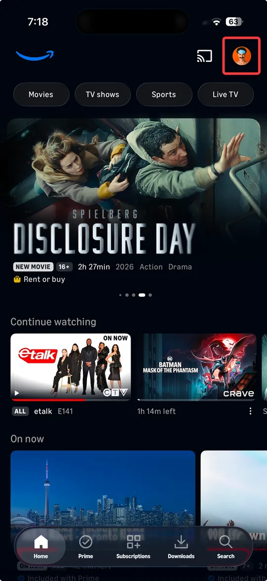
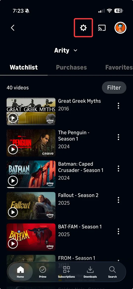
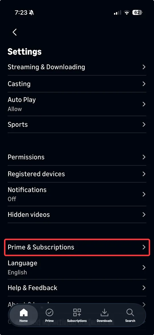
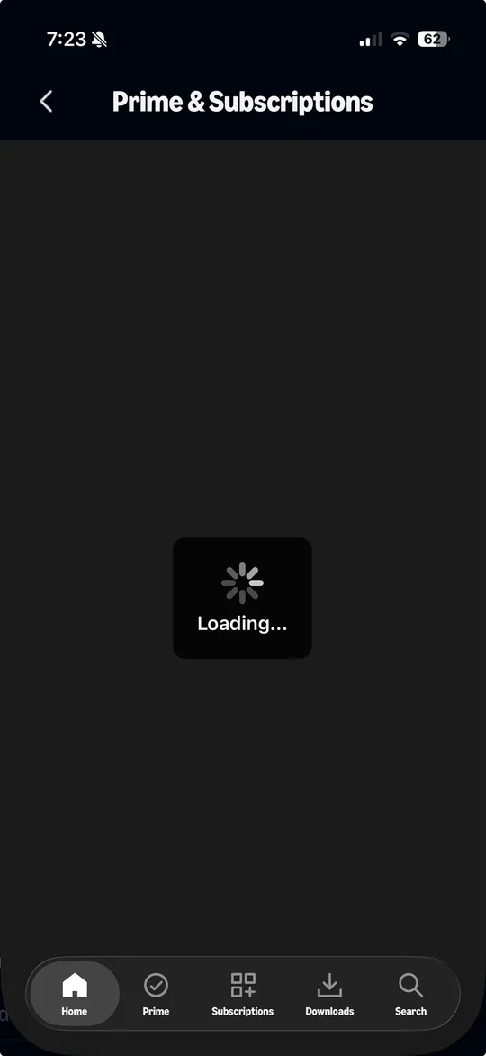
The journey runs from Home through the profile and Settings to “Prime & Subscriptions”, a label that reflects how Amazon organises its products rather than what people look for: subscriptions, channels, billing, or simply TSN.
- 01HomeStart from the profile picture, the only clue.
- 02ProfileAccount tasks hide behind the settings gear.
- 03Settings“Prime & Subscriptions” sits among unrelated rows.
- 04LoadingA generic spinner, with no sense of where you are.
- 05Prime & SubscriptionsA white, web-style page inside the dark app.
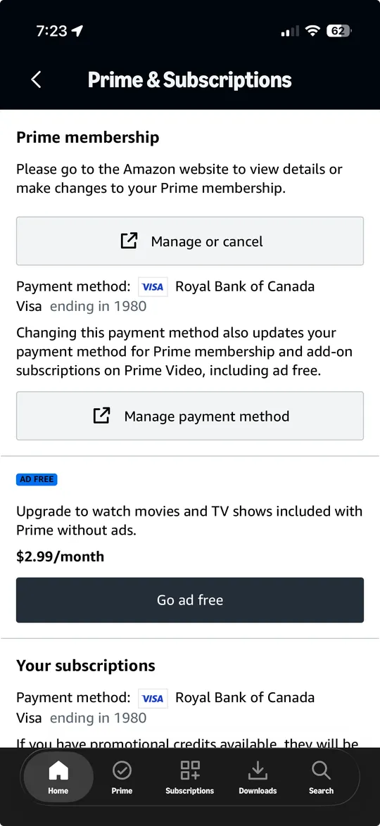
- 06TSNChannel subscriptions are at the bottom, managed by text links.
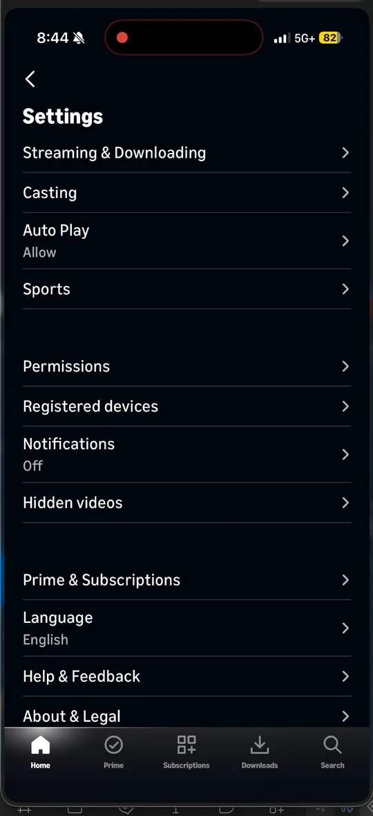
- 07RestartThe only action is a link that opens a vague modal.
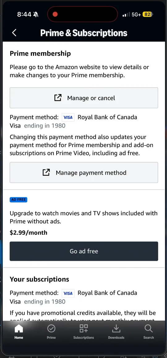
The experience asked people to understand Amazon’s account structure before they could finish their own task.
UX audit
I evaluated the original experience heuristically. Each problem is traced to its effect on people, the principle it breaks and how the redesign responds. Pick a row to read it.
“Prime & Subscriptions” provides weak information scent
Users are unsure where channel subscriptions live
Match with user mental models
Renamed to Subscriptions & Billing
Design goals
- 01Discoverability
Users can predict where subscriptions are managed before opening the page.
- 02Transparency
Price, renewal, trial end, payment method and the consequences of cancelling are visible before committing.
- 03Control
Changing or cancelling never means decoding a vague “manage” page or a retention maze.
- 04Continuity
Account management feels like part of Prime Video, not a website loaded inside it.
Information architecture
Four ways to show your subscriptions
The problem began before TSN was even visible, so I started with the structure, not the TSN screen.
- Option APrime expanded, channels as links
Kept Prime prominent, but recreated the imbalance and mixed two interaction patterns.
- Option BEvery subscription expanded
Everything up front, but long and hard to scan as subscriptions are added.
- Option CAccordion cards
Shorter, but caused layout shifts and many mini account pages.
- ChosenConsistent cards + a details screen
The overview says enough to understand your account; details open only when you want to manage one.
Wayfinding
Here is how the original page turned into the new one. Each part of the old page maps to a clearer place in the redesign.
 Subscriptions & Billing
Manage your Prime membership and Prime Video channel subscriptions.
Prime Membership
 Amazon Prime Active$10.99/mo
 Renews Dec 1
Upgrade to watch movies and TV shows included with Prime without ads.
$2.99/monthGo ad freeChannel Subscriptions
 Crave Free trial$10.99/moFree until Jul 24
 TSN Active$29.99/moRenews Jul 27
Past Subscriptions
 Paramount+ Ended
Final design
Try it
Tap through the redesigned flow: cancel Prime and continue it again, cancel the Crave trial, switch plans, or add a card. The reasoning behind each screen appears beside the phone.
Cancellation & plan changes
Cancellation as a trust problem
Someone cancelling wants to know: am I cancelling now, do I lose access, will I still be charged, and did it work? I treated those questions as requirements, and kept cancellation visible instead of hiding it behind retention screens.
Cancelling rarely means losing access right away, so every subscription moves through clear, reversible states.
Renews Dec 1
Access until Dec 1 · no further charges
Moves to Past Subscriptions
Microcopy that removes doubt
Money and future commitments turn ambiguity into anxiety. A few sentences do a lot of the work:
- Removes uncertainty during a scheduled plan change.Switch to Prime Annual?
Your new plan will start on Dec 1, 2026, when your current billing period ends. You’ll be charged $99.99 on that date. You won’t be charged today.
Confirm changeGo back - Removes uncertainty around free-trial cancellation.Cancel your Crave free trial?
You’ll keep access to Crave until July 24, 2026. You won’t be charged when the trial ends.
Keep free trialCancel free trial - Removes the fear that cancelling ends access immediately.Cancel your Prime membership?
Your Prime benefits will remain active until Dec 1, 2026. You won’t be charged again.
Keep membershipCancel membership - Confirms the action worked without implying the account is already inactive.
Your Prime membership is scheduled to end. You can continue using your Prime benefits until Dec 1, 2026.
Done
Foundations
Loading that keeps your place
The original loading screen was where the app most clearly stopped feeling native. I explored two branded loaders, and the page title and navigation stay on screen while content loads.
Visual continuity
The redesign stays inside Prime Video’s dark environment. Status is never carried by colour alone: labels such as Active, Free trial, Ends Jul 24 and Starts Dec 1 hold the meaning.
The bottom navigation is unchanged, so nothing has to be relearned. One detail I’d validate: which tab should be highlighted on these screens, so people always know where they are.
- Dark surfacesKeep continuity with the rest of Prime Video
#00060F - Card surfacesGroup related information
#2C2C2C - Prime blueActive, current, selected and interactive
#0779FF - Muted redReserved for cancellation
#FF6B6B - Neutral greyMetadata and explanations
#A2A2A2 - WhiteHigh-emphasis text
#FFFFFF
Outcome
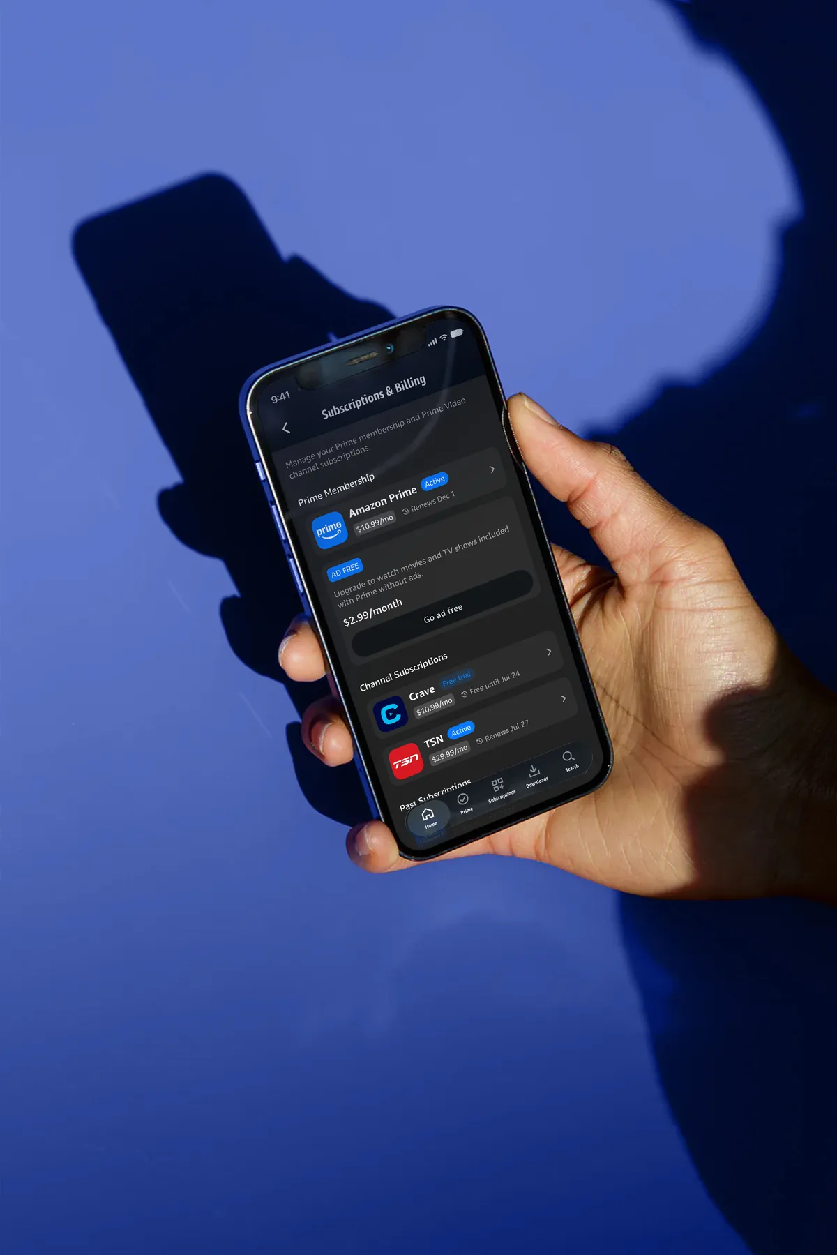
Five questions, always answered
The biggest improvement wasn’t fewer steps. It was making every step easier to understand. Throughout the journey, the redesign answers:
- 01Where am I?Subscriptions & Billing
- 02What am I managing?Amazon Prime Active$10.99/moRenews Dec 1
- 03What can I do?Cancel membershipChange plan
- 04What will happen next?Prime Monthly Current until Dec 1Prime Annual Starts Dec 1You won’t be charged today.
- 05Did my action succeed?Amazon Prime Ends Dec 1Your Prime membership is scheduled to end.

Next steps
This is a heuristic and interaction redesign, not yet a validated product. Next, I’d run usability tests measuring task success, time on task, mis-taps, backtracking and confidence, on:
- 01How quickly people find Subscriptions & Billing
- 02Whether active subscriptions and free trials are understood at a glance
- 03Whether Change plan and Cancel membership are told apart
- 04Whether scheduled states such as Ends Jul 24 are read correctly
- 05Whether adding a card and setting it as the payment method feel like separate steps
- 06Which loading treatment gives clearer feedback
- 07Whether promotional content gets in the way of account tasks
Good subscription UX is less about minimizing taps and more about minimizing uncertainty.