
Background
Daily Racing Form is a legacy horse racing data platform used by bettors, handicappers, and racing professionals to evaluate races through statistics, historical performance, and expert analysis.
The strength of DRF has always been its depth of data. However, that same data density created a major usability challenge. Professional users could interpret the information, but newer or casual users often struggled to understand racing terminology, compare horses, and make confident decisions.
DRF AI was created to bridge this gap by transforming dense racing data into a conversational experience where users could ask questions and receive clear, contextual insights.

The project’s initial chat experience was established before I joined by Haptiq’s design team. Building on that foundation, my work focused on evolving the broader AI product experience, designing interactions, features and responsive states, creating reusable UI patterns, contributing to implementation-ready designs, and supporting a shared design-system foundation for DRF AI, DRF Newbie, and future DRF platform updates.
Problem
Data Complexity + Design Fragmentation
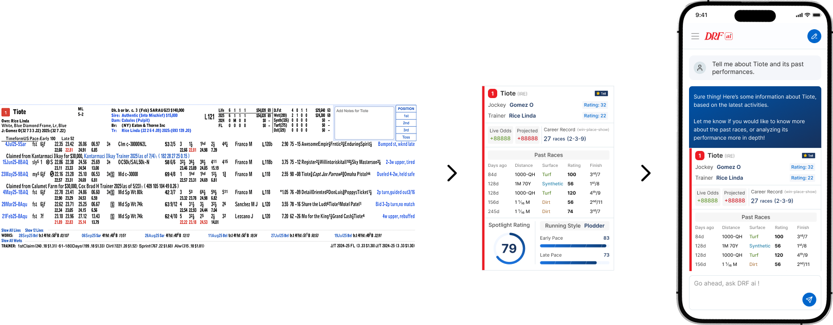
DRF had two connected challenges. Users were overwhelmed by the complexity of horse racing data, while internal teams were working across fragmented UI patterns. Different products used different colors, text sizes, layouts, and components, which created inconsistency for users and inefficiency for design and engineering teams.

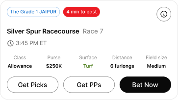
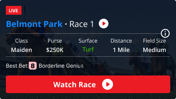
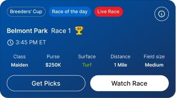
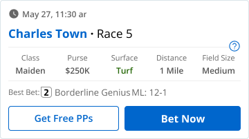
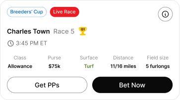
User Problem

Too much information

Complex terminology

Static racing forms

Unclear decision paths
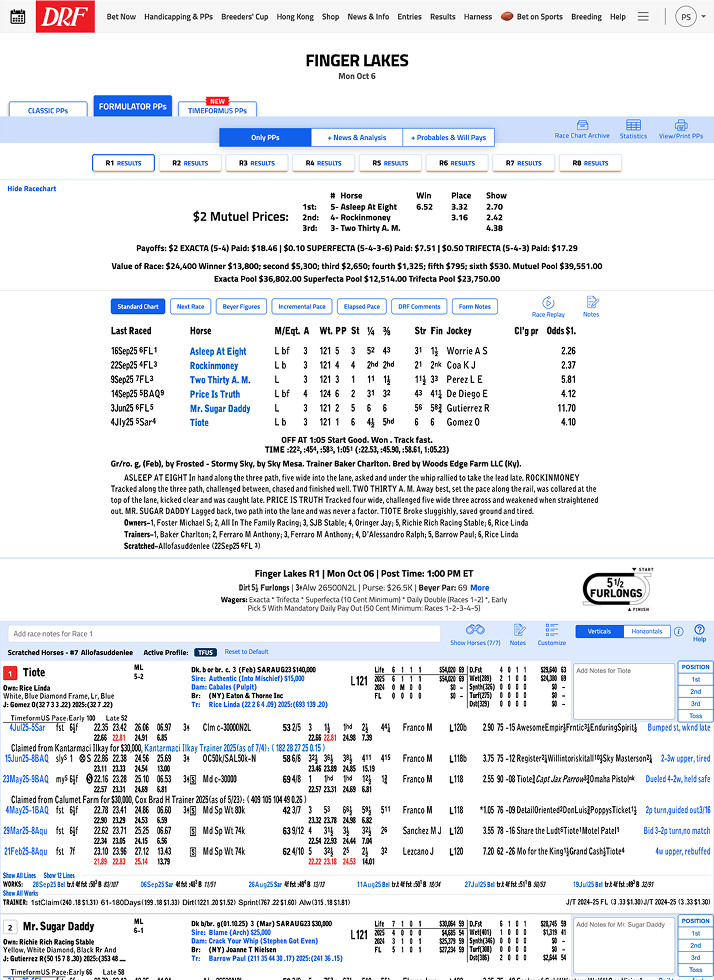
System Problem
DRF products were fragmented:

Inconsistent colors

Inconsistent typography

Different UI patterns across products

No use of tokens and components

No unified design system
Design Challenge
How might we help users understand complex horse racing data faster, while creating a scalable design foundation that could unify DRF’s broader product ecosystem?
Solution
Global Design System Foundation
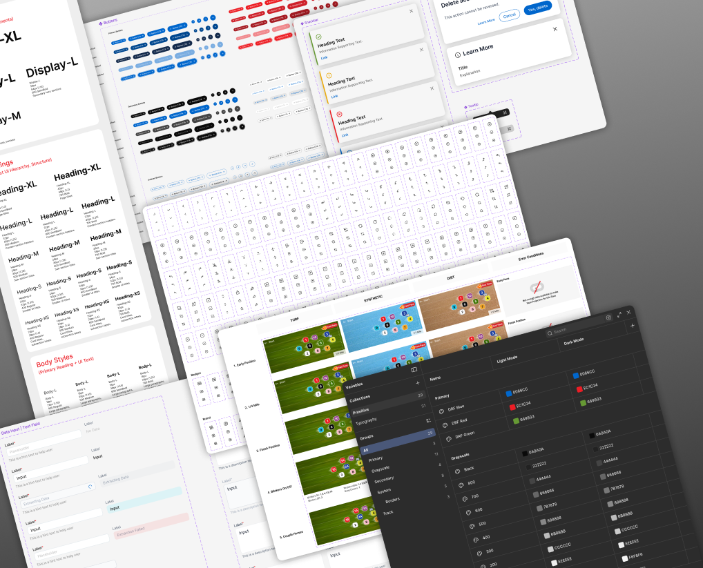
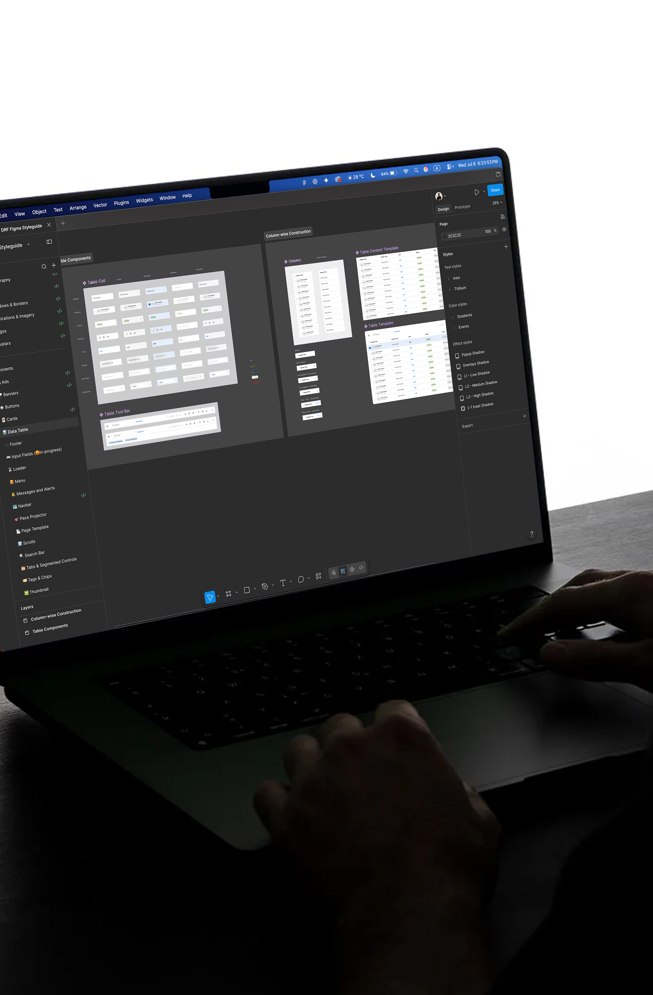
Before designing the interface, I defined the DRF Global Design System to create a single source of truth across products. This included standardizing typography, colors, spacing, components, and documentation so that all the DRF products I was working on could feel native to the ecosystem.
DRF AI Product Experience
Natural Language Querying
Users can ask questions instead of manually searching through complex tables.
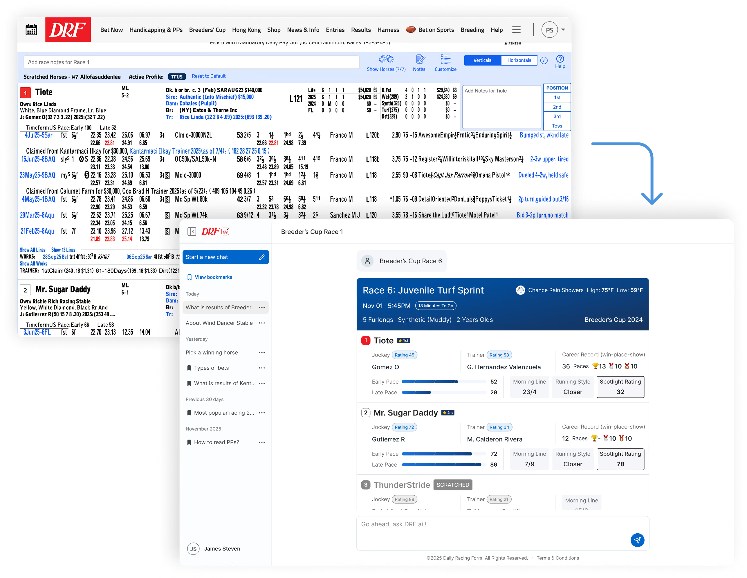
Structured AI Responses
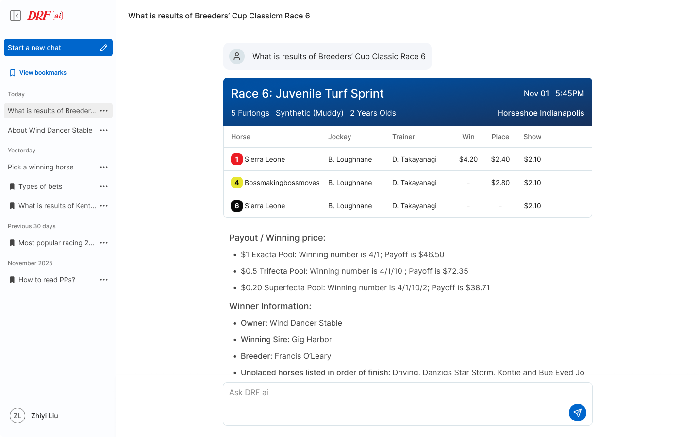
AI answers are displayed as race cards, horse cards, stats, and insights.
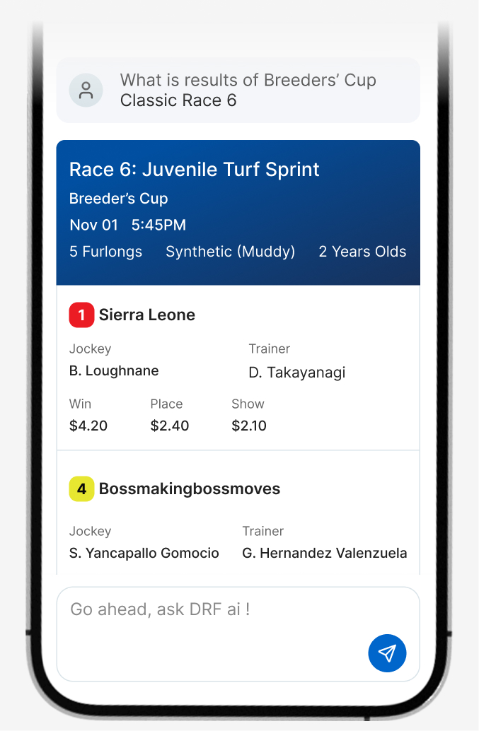
High-Density Data Visualization
The interface turns dense racing information into scannable mobile and desktop layouts.
Trust & Explainability
Loading states and supporting data help users understand what the AI is calculating.
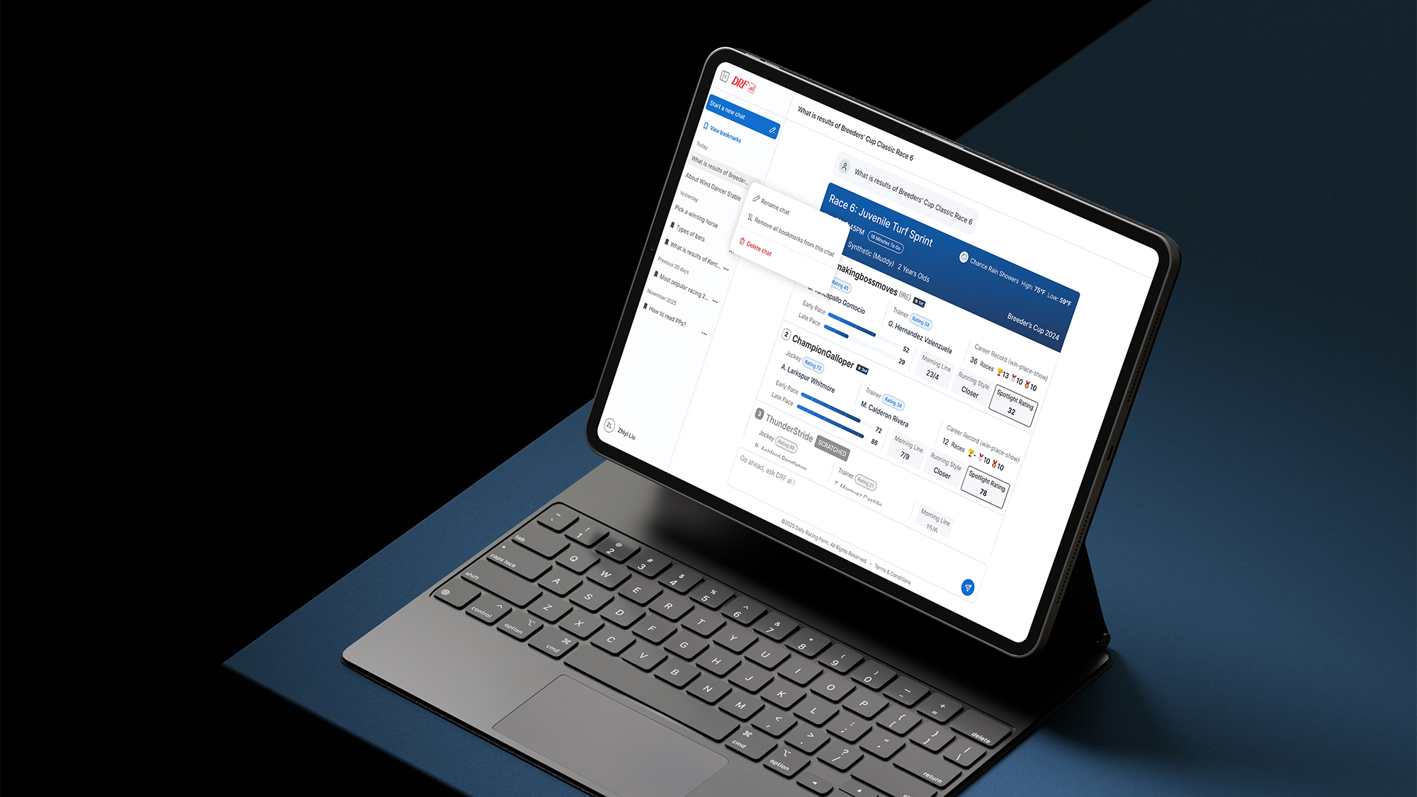
Interaction Design Details
Prompt-first UI
Users can ask questions directly instead of navigating dense racing data manually.
This reduced the friction between curiosity and insight, helping users move from data exploration to decision-making faster.
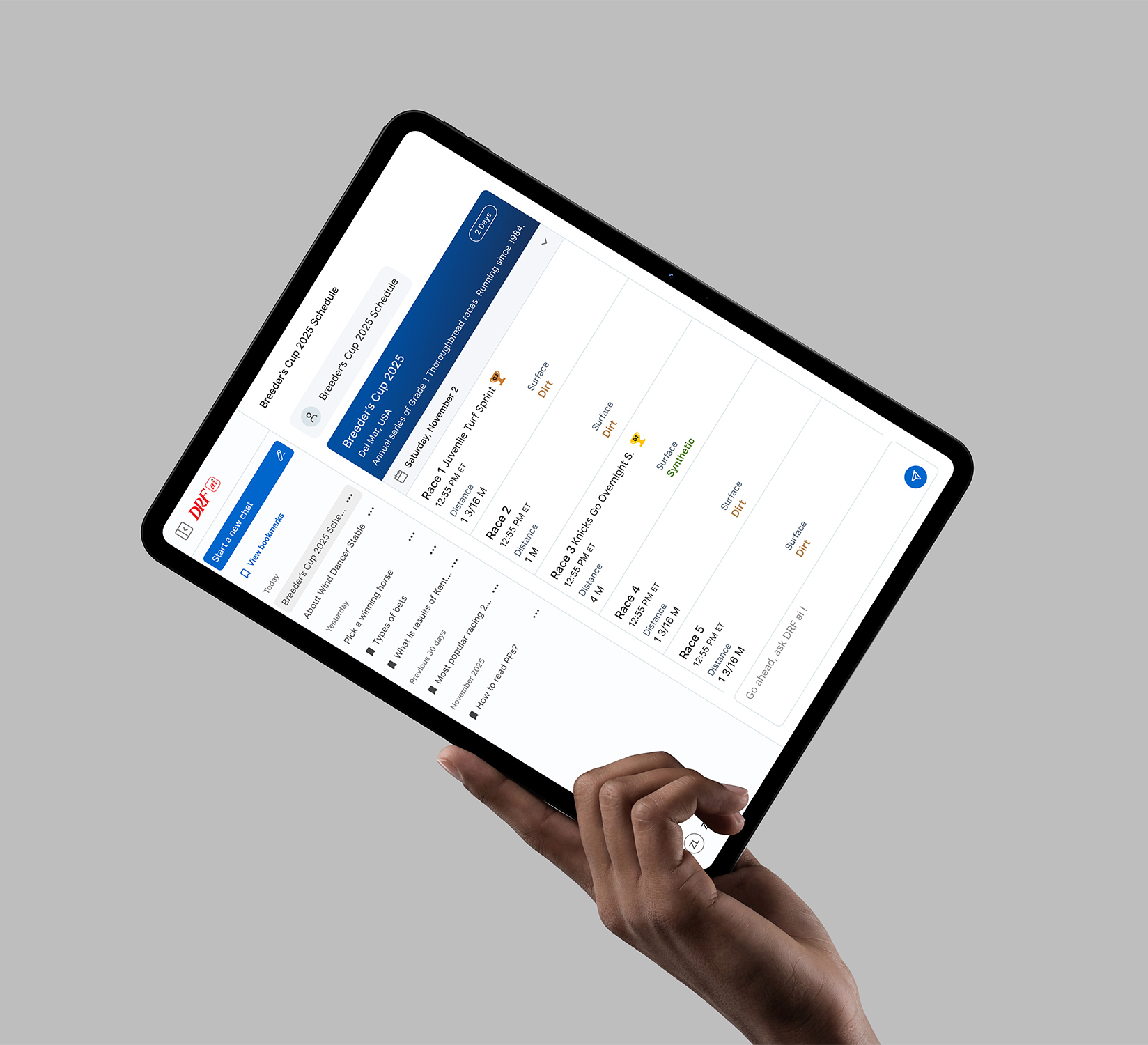
Chat input
A familiar chat field supports quick questions about races, horses, tracks, conditions, past performances and betting strategies.
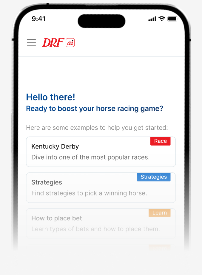
Suggested prompts
Starter prompts guide users and reduce the friction of not knowing what to ask.
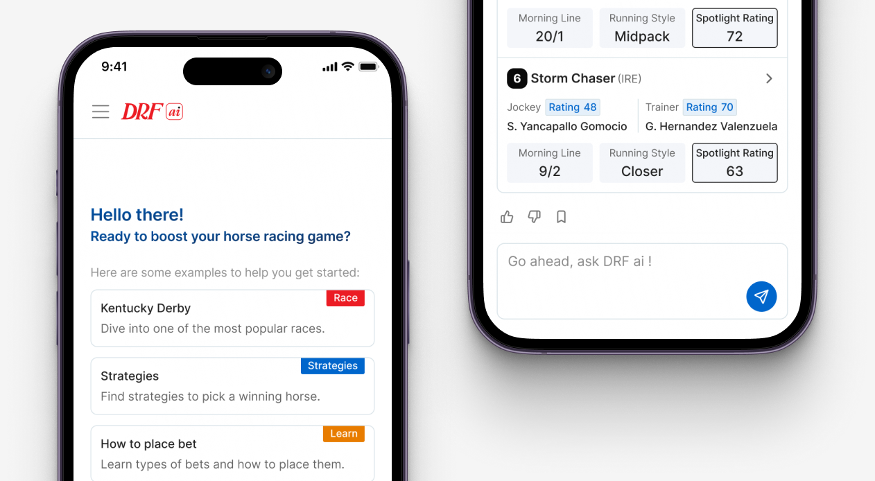

Response cards
AI answers are organized into scannable cards with race details, stats, and recommendations.
Skeleton loading
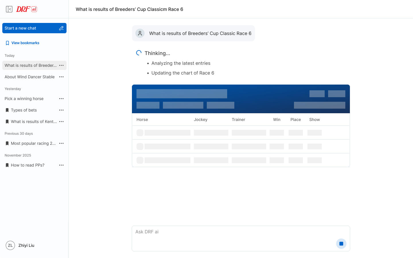
“Thinking” states show the AI is analyzing data, making the experience feel more transparent by communicating that the AI is actively processing information.
Bookmarks
Bookmarking allows users to save important AI responses and return to specific insights later. This was especially important for users comparing races, tracking horses, or reviewing recommendations before making a decision.

Global Design System
Dev-Ready Design & Handoff
To reduce design-to-development friction, I documented components with interaction states, responsive behavior, and implementation logic. The goal was to make the design system not only visually consistent, but also usable as a practical bridge between design and engineering.
Integration
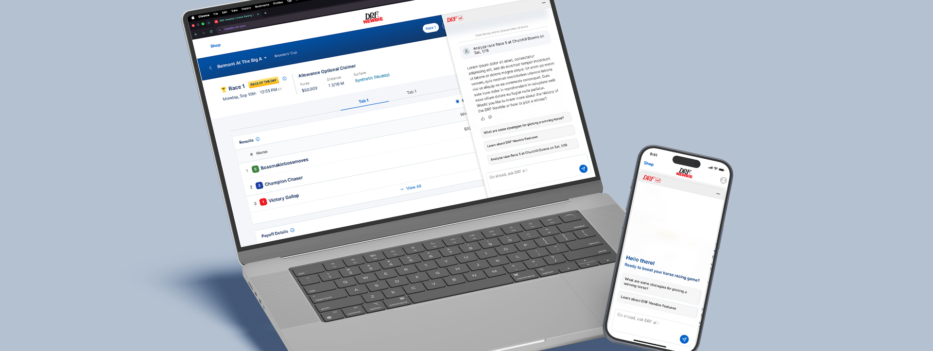
DRF Newbie AI
Horse racing is notoriously difficult to learn. DRF Newbie existed, but it lacked a "human" guide to help users navigate through the data quickly.
After designing the broader DRF AI experience, I also explored how the same intelligence layer could support first-time users inside DRF Newbie. Instead of exposing beginners to the full AI product, I designed a lightweight assistant focused on quick questions, simplified explanations, and guided educational prompts.
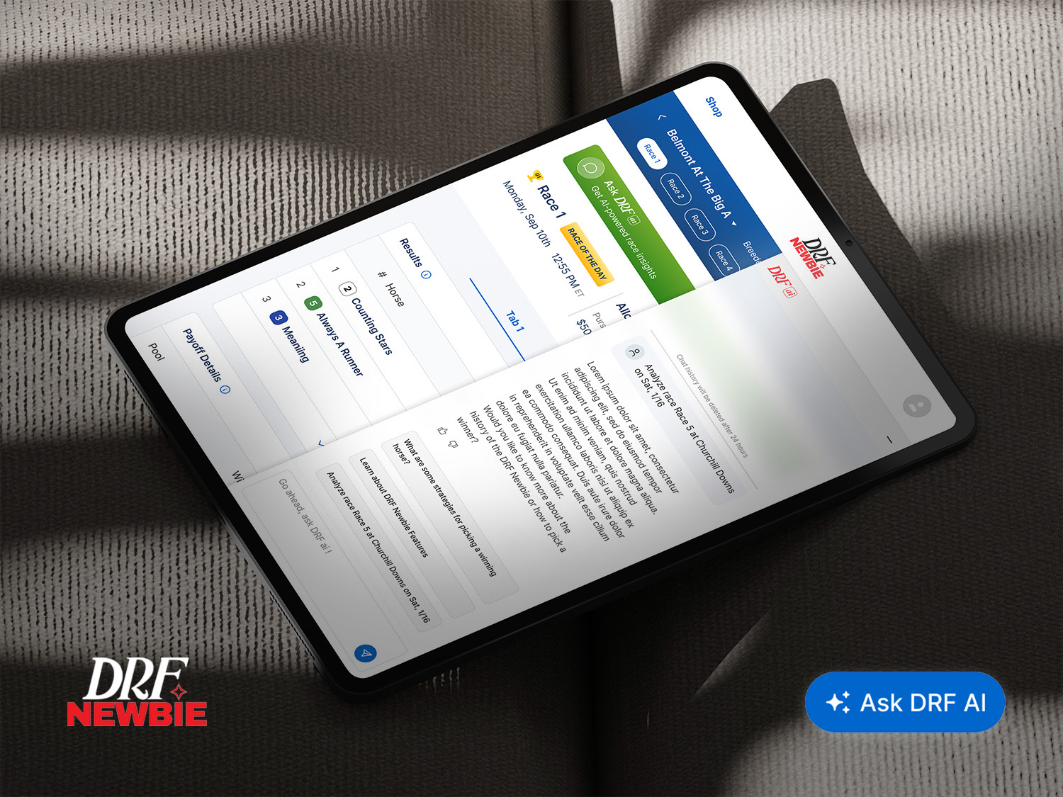
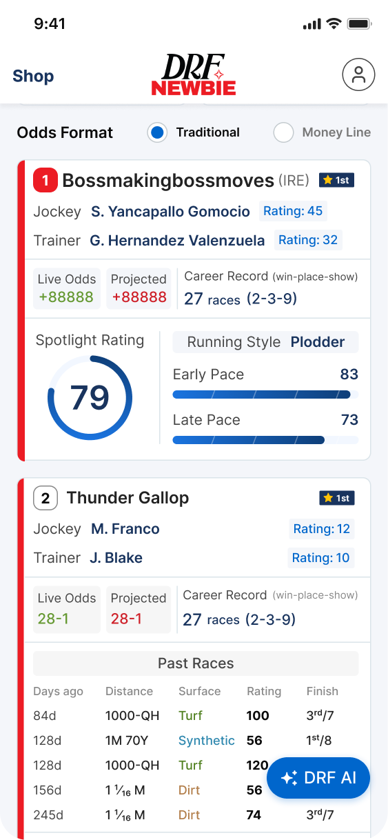
Persistent Floating Action Button (FAB), labeled "DRF AI" using the Global Design System’s secondary action styling, which is always accessible but non-intrusive.
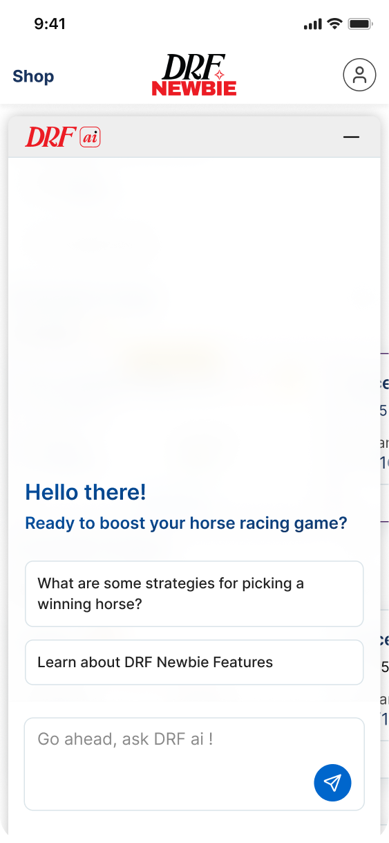
When triggered, it utilizes an Expandable Bottom Sheet (Rail).
DRF AI logo in the header to show the product that this feature is from, and a Minimize (negative) icon on the top-right to close the overlay.
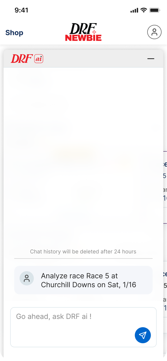
It has a 24-Hour TTL (chat history is automatically purged after 24 hours), which reduces database overhead and prevents the "Newbie" interface from becoming cluttered with old logs, keeping the focus on the current race day.
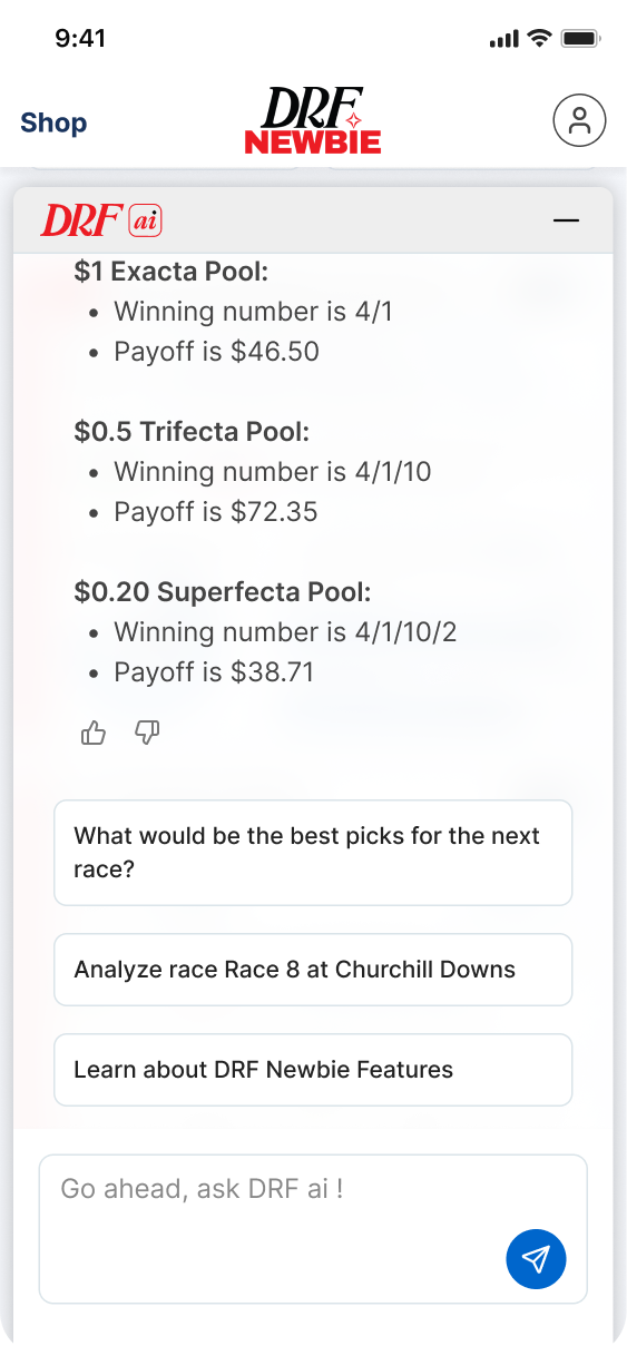
This version is architected as a Short-Session assistant specifically for the Newbie persona.
It uses a Guided Prompt system, suggesting basic questions to prevent user cold-start.
Results & Impact
Product Impact
Reduced time-to-insight
Helped users ask questions instead of manually interpreting dense data
Made AI-generated race analysis easier to understand
System Impact
Created reusable patterns for AI experiences
Helped unify UI across DRF products
Supported future DRF homepage and Newbie experiences
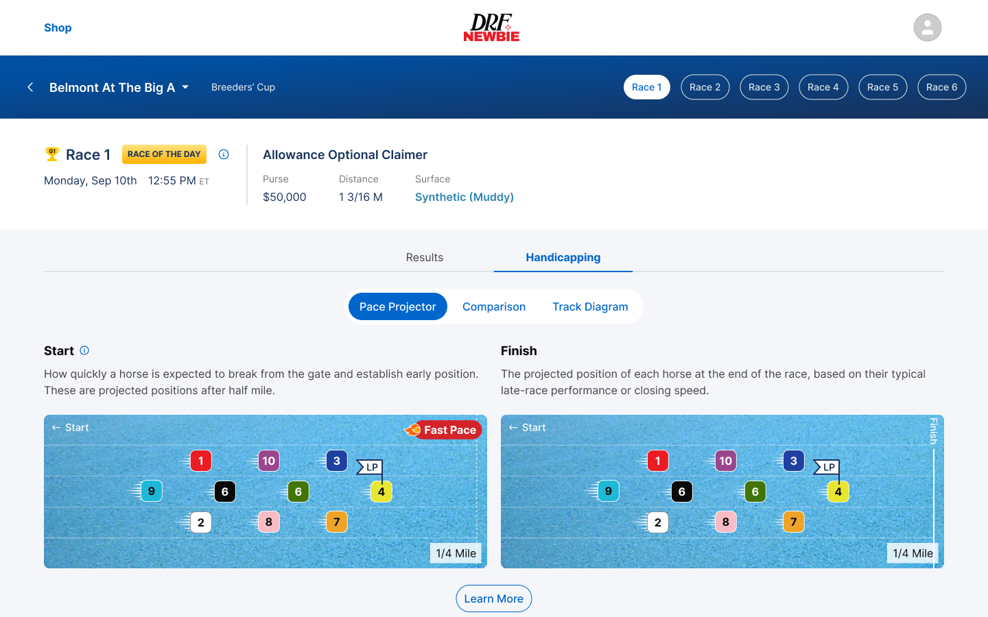
DRF Newbie
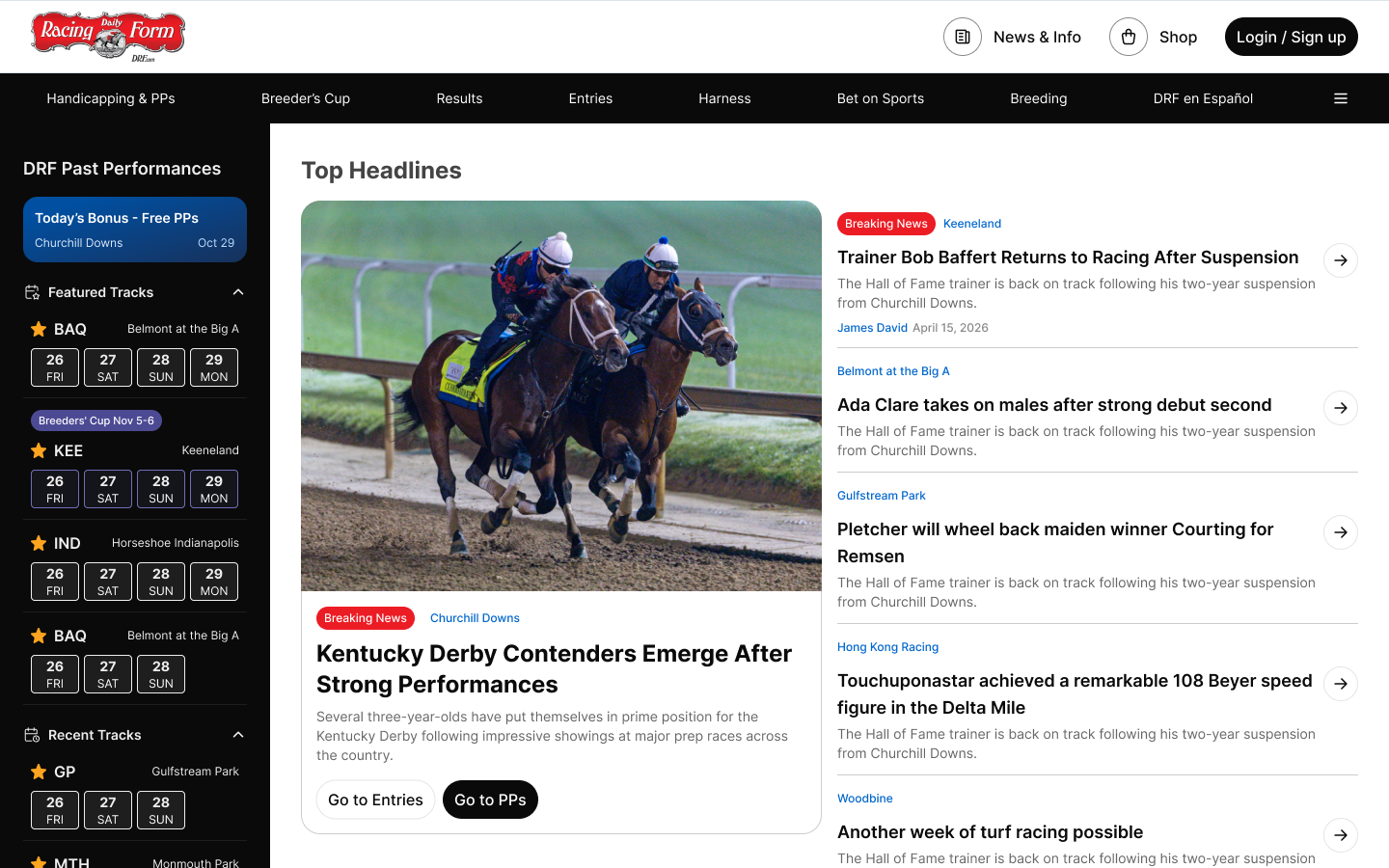
DRF Homepage Redesign
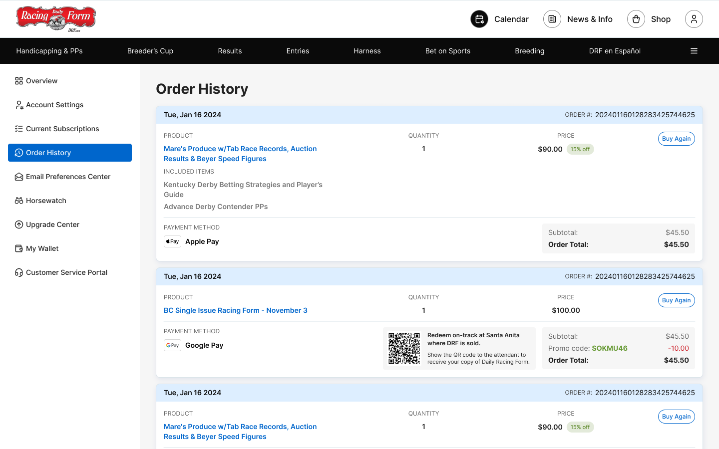
DRF Member Center Redesign
Team Impact
Created a published component system which saved 2 hours of timing every day for the designers working on DRF products
Improved design-dev alignment
Reduced duplicated component work