Background
Haptiq operates across two connected sides of the business: a service side and a product side.

On the service side, Pantheon (my team) functions as Haptiq’s technology enablement solution suite, supporting clients through product development, value creation, UX/UI design, consulting, system integrations, AI and data science, intelligent automation, cloud engineering, marketing technology, ITSM, and digital transformation.

On the product side, Olympus serves as Haptiq’s SaaS platform foundation, powering enterprise dashboards, management systems, and client-facing solutions. As Olympus became the base for more advanced products and implementations, the platform needed a tokenized design system that could support high-density data interfaces, AI-enabled workflows, white-label products, and global delivery teams.
Olympus Product Ecosystem
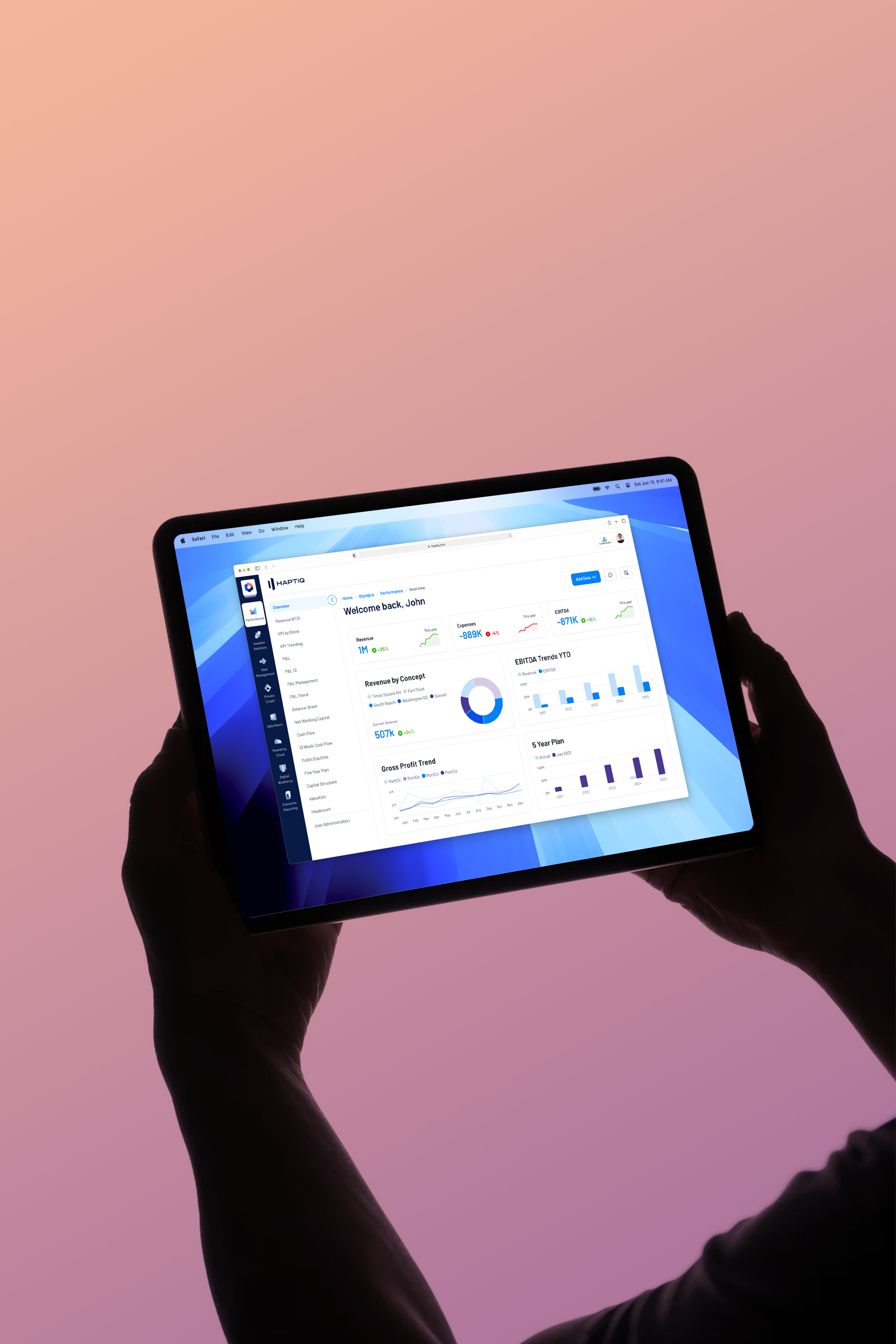
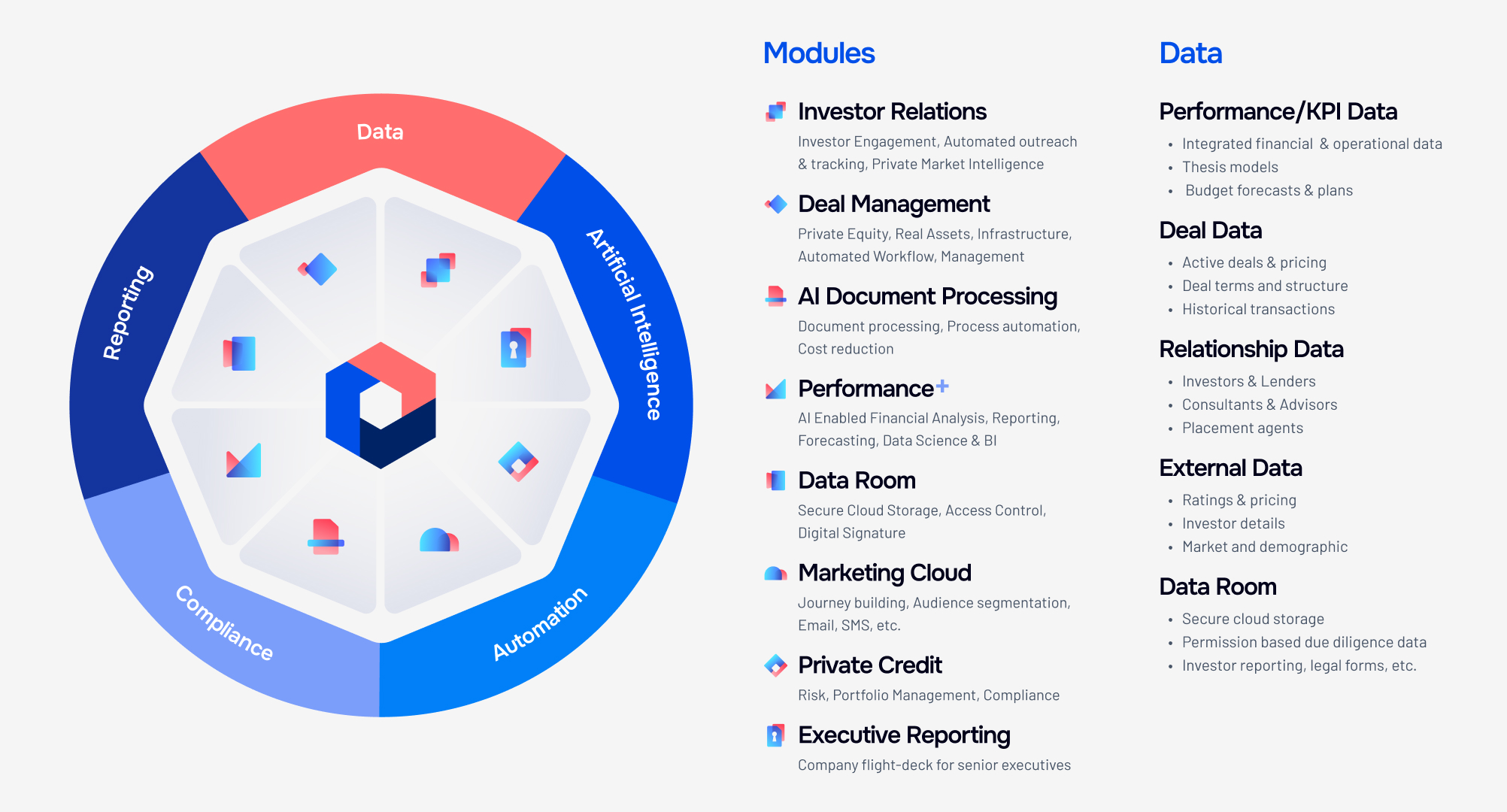
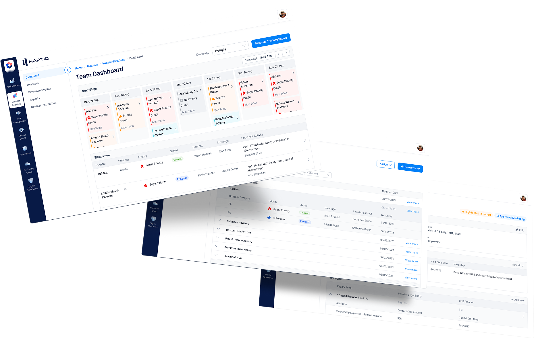
Olympus was not a single dashboard. It was a modular SaaS ecosystem supporting the full alternative asset management lifecycle, from fundraising and investor engagement to investment, portfolio management, reporting, and exit.
The platform included modules such as Investor Relations, Deal Management, AI Document Processing, Performance+, Data Room, Marketing Cloud, Private Credit, and Executive Reporting. Each module had different workflows, data needs, and user expectations, but all needed to feel like one unified product experience.
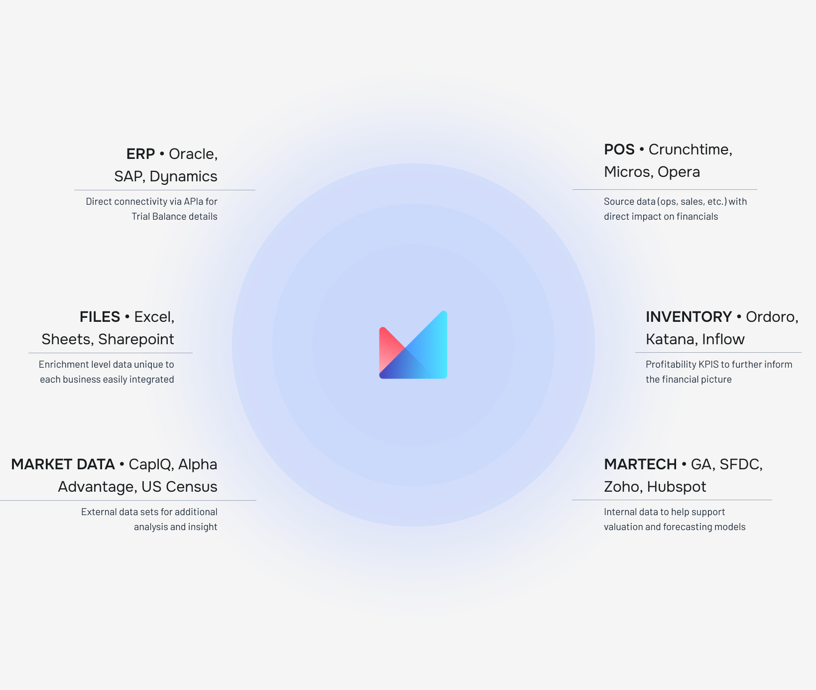
Because Olympus also connected multiple data sources, including ERP systems, POS systems, inventory platforms, files, market data, and marketing technology tools, the design system had to support dense tables, KPI cards, charts, filters, alerts, permission-based data rooms, and AI-enabled insights while maintaining clarity and consistency.

Problem
We were growing.
Our design system could not.
As Haptiq scaled its client base, the existing design-to-development pipeline reached a breaking point.
The system lacked tokenization, which meant UI changes required manual updates across files and code. Different teams were working with inconsistent patterns, creating visual and functional drift. White-labeling was also difficult because switching from Olympus branding to a client-branded experience required manual overrides instead of system-level theme changes.
The result was slower delivery, duplicated design work, inconsistent UI quality, and unnecessary friction between design and engineering.
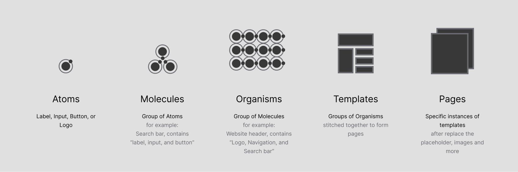
Design Goal
Move from designing individual screens to architecting a scalable system.
The goal was to create a single scalable design foundation that more than 100 designers and engineers could use to build consistent, enterprise-ready products across Olympus and Haptiq’s client solutions.
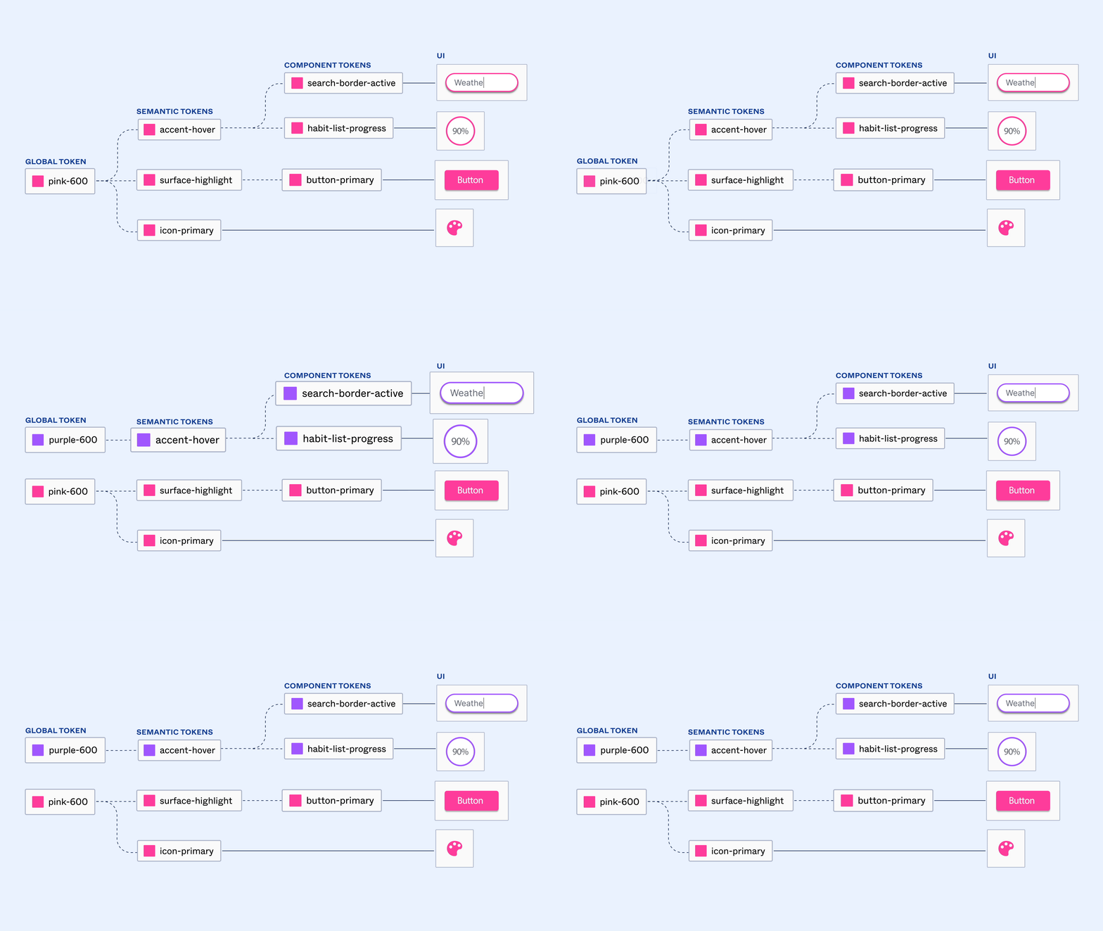
I collaborated with distributed design and engineering teams across North America, Poland, and India to help rebuild the system around design tokens, Figma Variables, multi-brand theming, and design-to-code alignment.
We needed to create:

A single source of truth for global teams

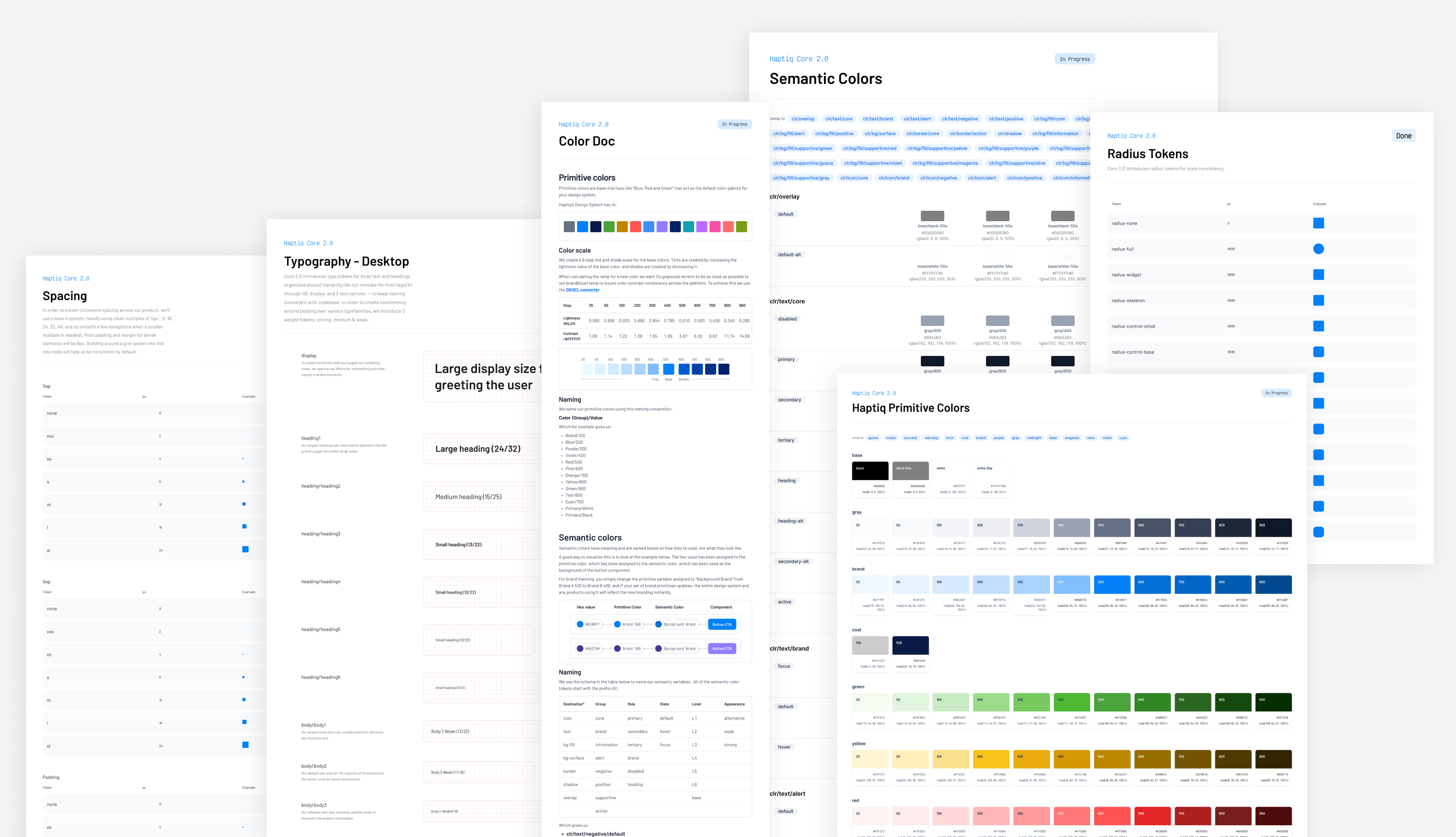
Tokenized foundations for color, spacing, typography, radius, and components

Multi-brand and white-label support

Better parity between Figma and production

Faster delivery for client-facing enterprise solutions

A flexible system for AI, data, dashboards, and high-density workflows
The Initiative
Design Tokens
for Everything
We launched a system-level initiative to decouple visual styling from component logic. Instead of relying on static styles, we rebuilt the design system around a multi-tier token hierarchy.
This allowed the product team to update brand, theme, and UI behavior at the system level rather than manually editing individual components or screens.
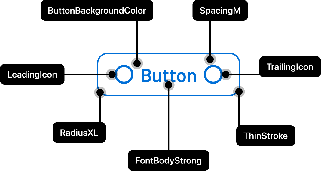

Token Architecture
The system was structured into 3 layers:
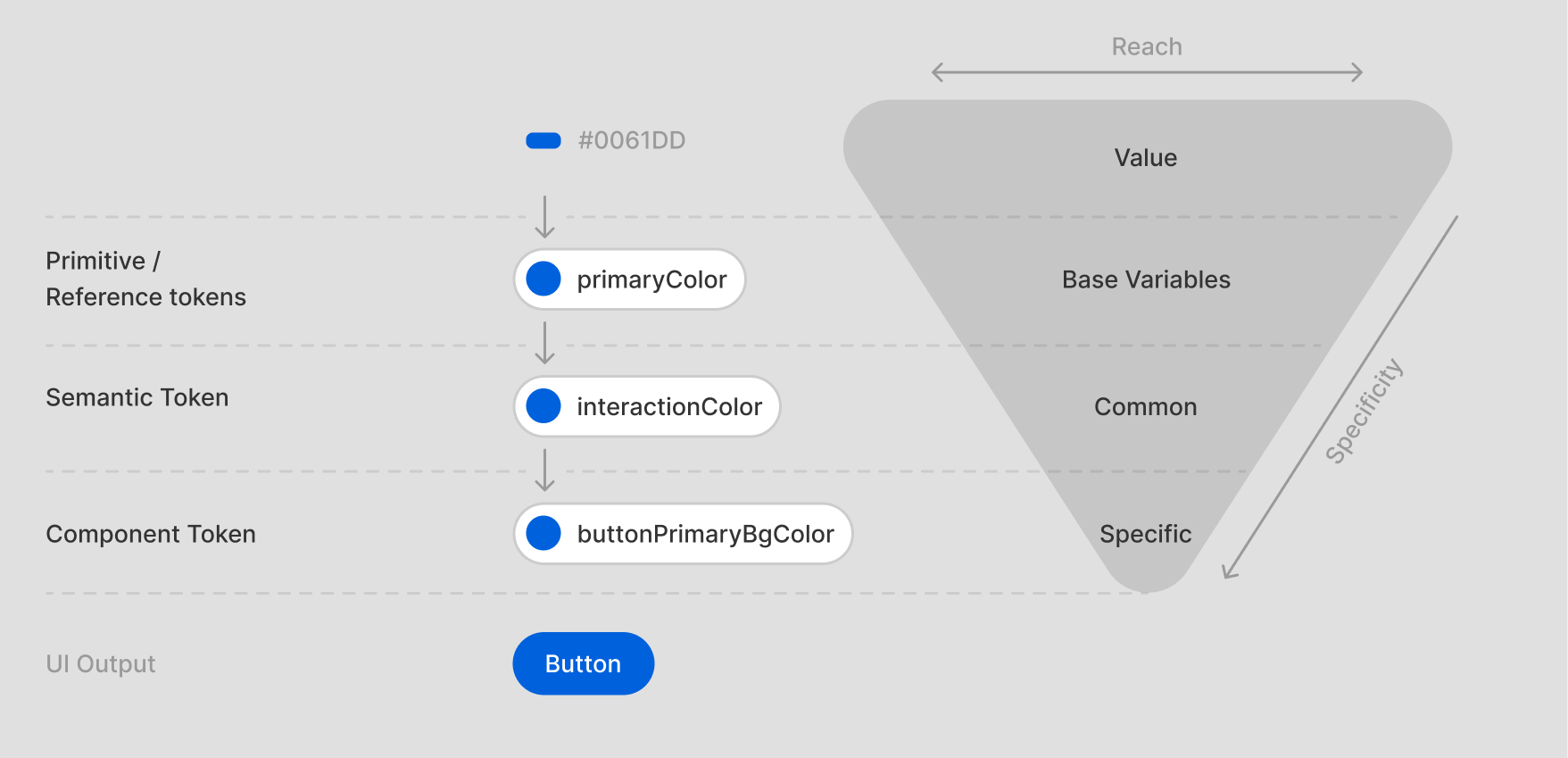
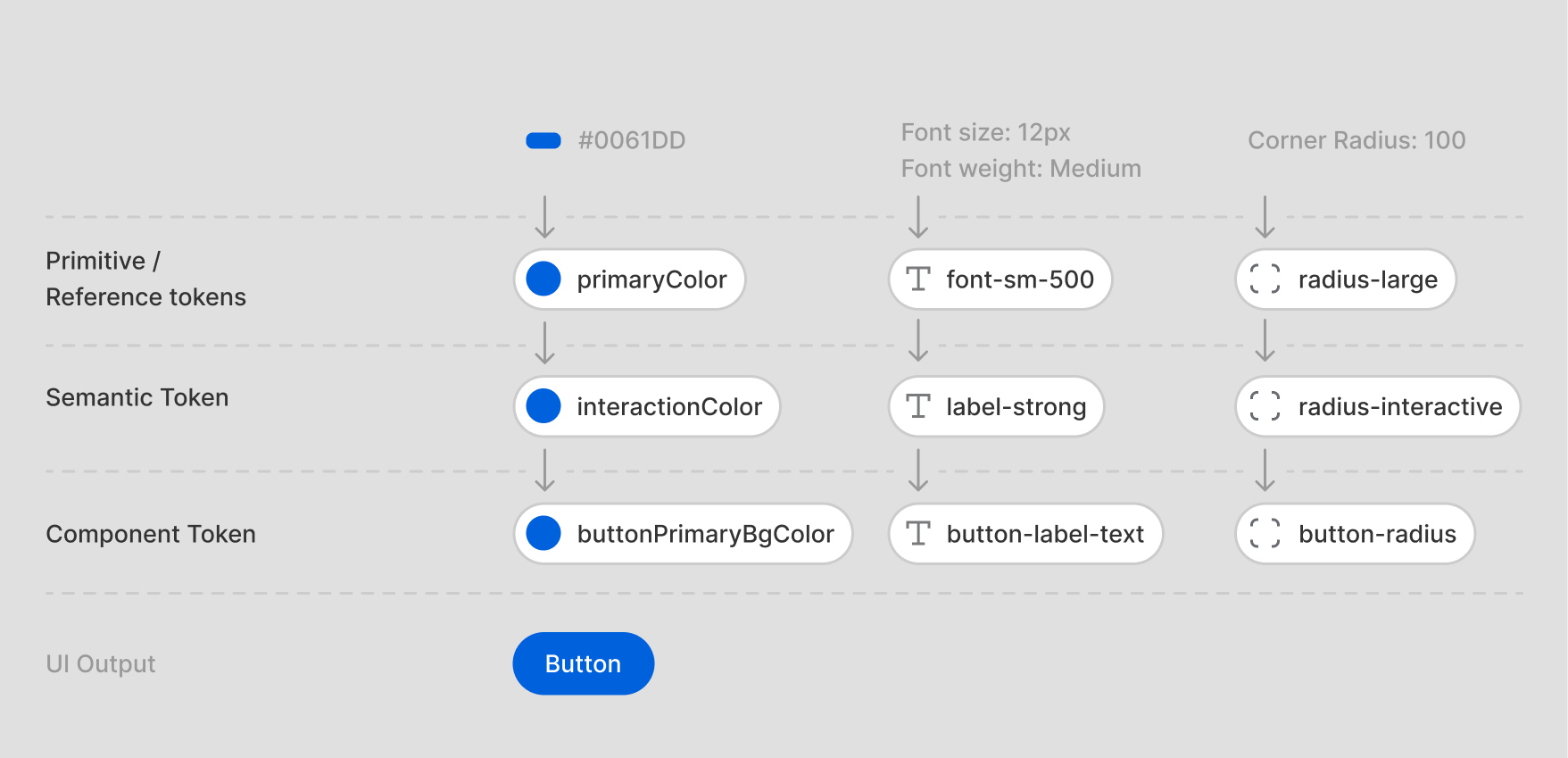
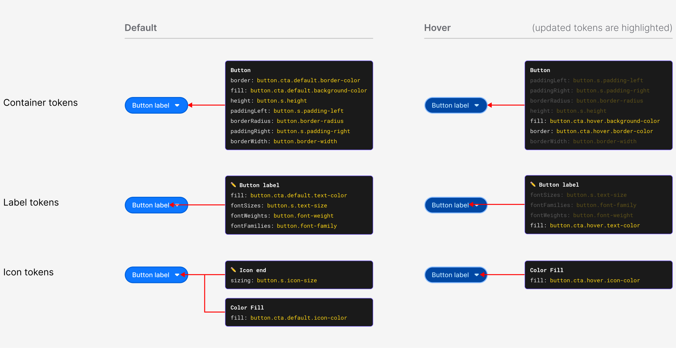
This structure made the system more flexible. A theme could change at the semantic level without breaking component logic, and component tokens gave teams more granular control when needed.
Variables & Multi-Mode Support
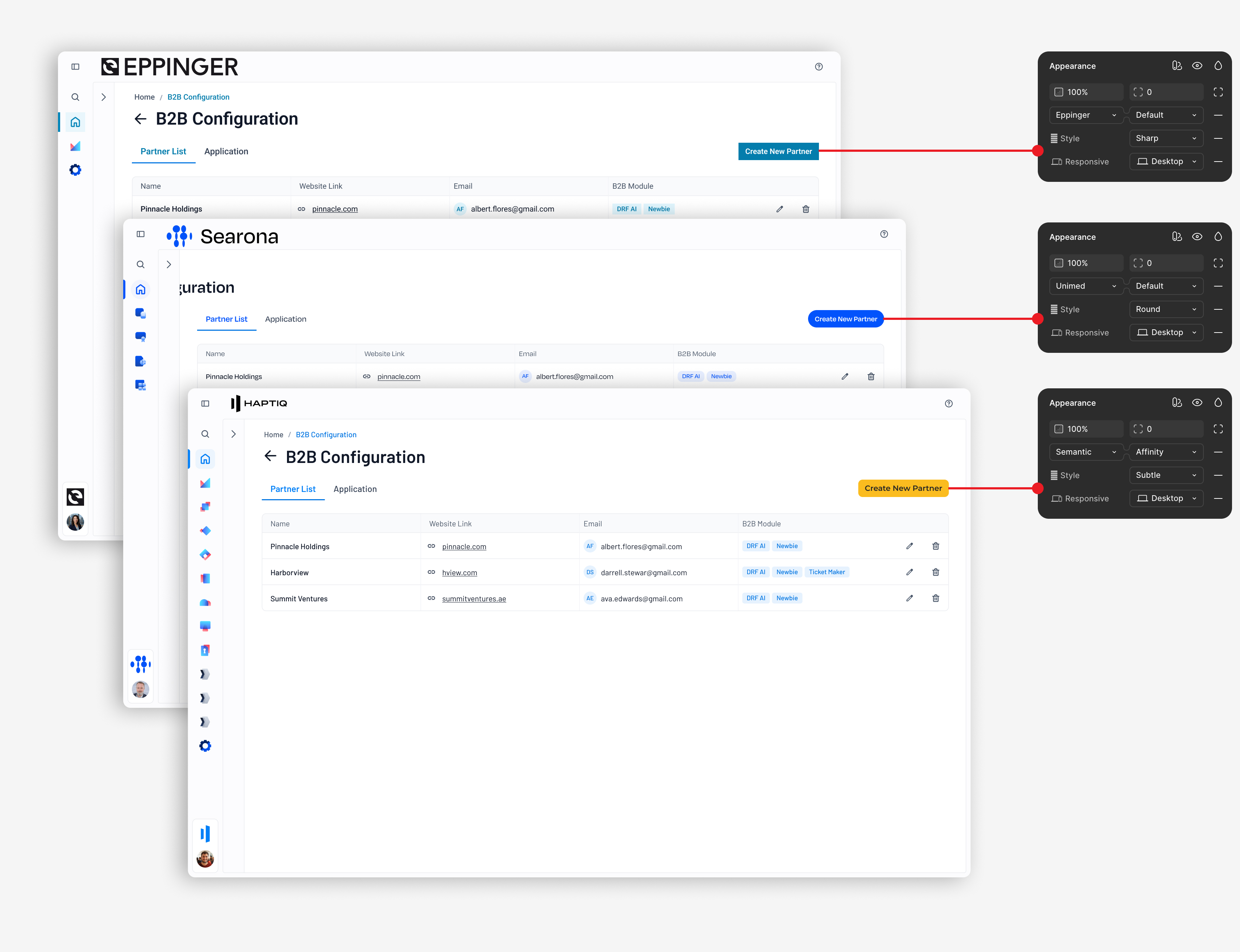
Using Figma Variables, we created modes that allowed teams to switch between default Olympus styling and client-branded themes inside the same system.
Instead of redesigning each client experience from scratch, teams could apply a new visual identity through the design system.
This supported:
Default Olympus theme
Client-branded themes
Light and dark modes
Scalable white-label configurations
Future product extensions
Dev Handoff
Figma-to-Code Alignment
A key part of the project was improving the relationship between design and engineering. Tokens were mapped to CSS root variables so developers could implement values directly instead of interpreting static design files.
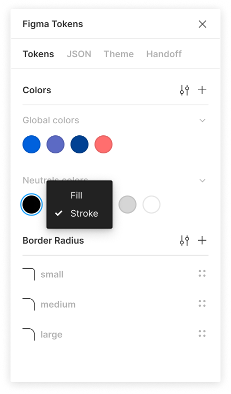
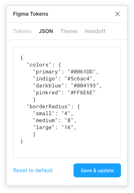
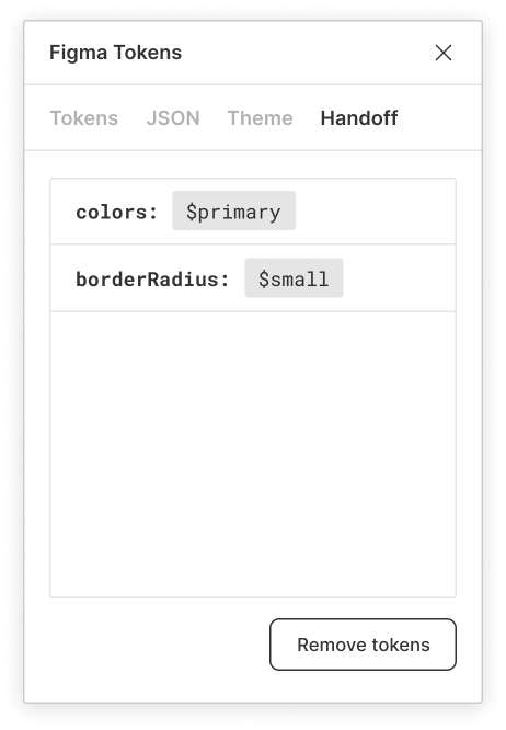
This created stronger parity between Figma and production, reduced ambiguity, and helped distributed teams work from the same system language.
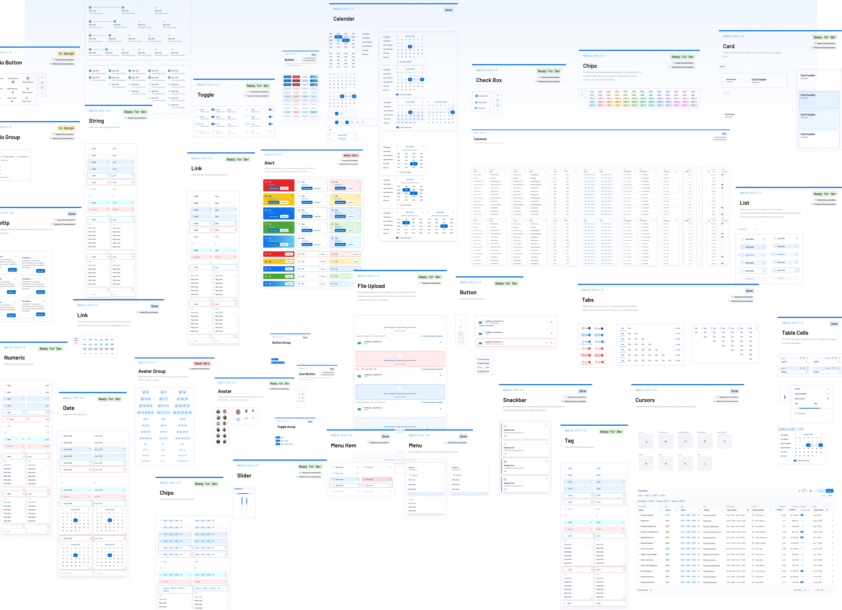
Component Library
The global design system included reusable components optimized for enterprise dashboards and high-density data products.
Components included: buttons, inputs, dropdowns, filters, tables, cards, modals, alerts, tags, chips, navigation, sidebars, data visualizations, pagination, tooltips, and form patterns.
Impact
The redesigned system created measurable operational leverage.

Increased development velocity by 40%

Reduced branded environment deployment from weeks to hours

Created a single source of truth across the global product suite
Improved consistency across dashboards, modules, and client solutions

Reduced design debt caused by duplicated styles and manual overrides